Fintech
Mobile App
Product Design
2025

The 77 million Trap
Around 77 million Americans are currently in debt collections. Most don't know which loan to pay first and that confusion costs them thousands in avoidable interest.
The Problem
People were paying their debts every month and still drowning. Not because they lacked money, but because they lacked direction. Which loan first? Which card? How much extra? Nobody was answering that.
Debt Overwhelm
Users don't know which debt to pay first, leading to decision paralysis and minimum payments.
Hidden Costs
Interest compounds silently. Most users don't realize how much they're losing to interest over time.
No Clear Path
Existing tools show the problem but don't guide users toward actionable solutions.
Product Constraints
The product was designed as an MVP for a fintech founder targeting users with multiple active debts. The challenge was balancing simplicity with financial clarity while keeping onboarding friction low.
Key constraints included:
Designing trust quickly for first-time users
Reducing overwhelm without hiding important debt information
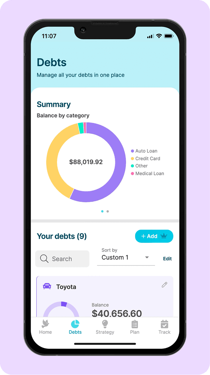
Supporting multiple debt types within a single flow
Creating a scalable structure that could later support AI-driven repayment recommendations
Delivering an MVP experience within a 6-week timeline
THE core user
The Overwhelmed Professional
User Pain Points
"I've been paying for two years and I still owe almost the same amount. I don't understand where my money goes."
"There are three apps on my phone for three different loans. None of them talk to each other. I just guess every month."
"I avoid opening my banking app unless I have to. It just makes me feel worse."
The problem wasn't discipline. It was the absence of a system that made the right move obvious.
Research combined founder discussions, market analysis, behavioral finance patterns, and competitor evaluation across existing US debt management products.
Research findings
I analyzed 5 existing debt management apps in the US market including Tally, Undebt.it, and Debt Payoff Planner and identified three consistent patterns:
Visually Outdated
Most apps felt like they were built in 2015. No design language, poor hierarchy, information overload.
Emotionally Cold
Finance apps treated users like spreadsheets. No empathy, no motivation, no warmth.
0 Personalization
Everyone got the same generic dashboard. No smart recommendations, No "here's what YOU should do."
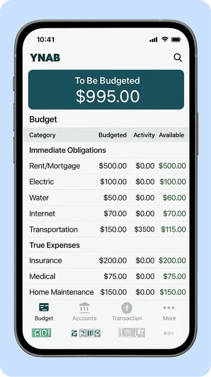
YNAB
Powerful but overwhelming. Designed for financially educated users not for someone drowning in debt and looking for a lifeline.
Undebt.it
Functional but cold. No mobile app, manual data entry, and a UI that creates more anxiety than it relieves.
Debt Payoff Planner
Data-heavy, emotion-light. Shows you the problem clearly but offers no intelligent direction on how to solve it.
A clear pattern emerged during analysis:
Most competitors optimized for financial tracking, but very few optimized for emotional decision-making and repayment confidence.
Design Opportunity
"If we build a product that feels calm, trustworthy, and personalized — we can own the emotional experience that competitors are ignoring."
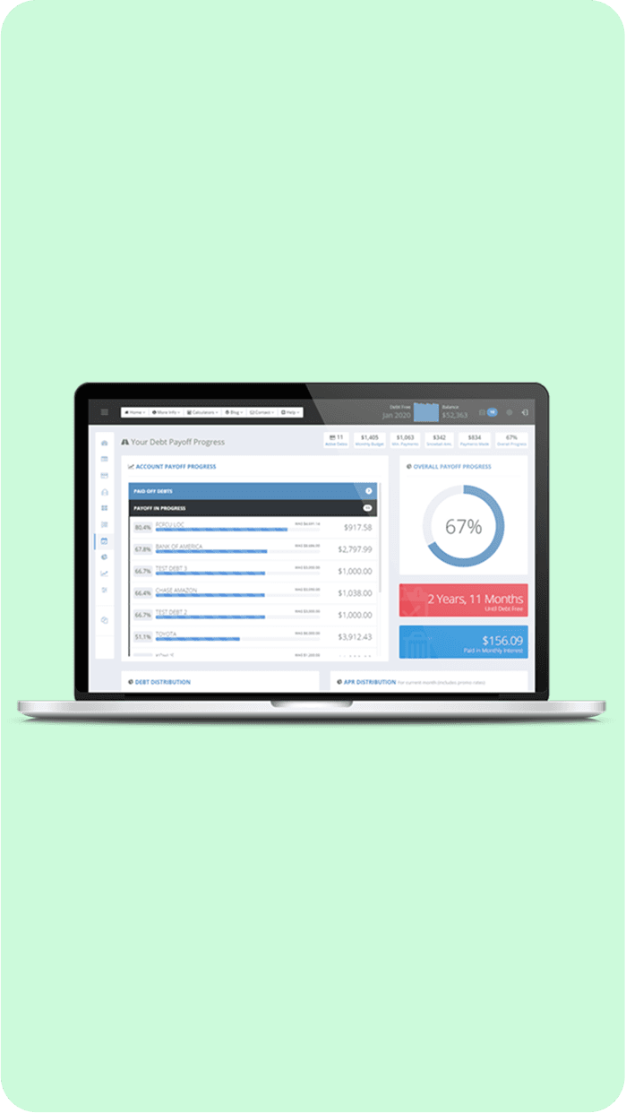
Information Architecture
The IA was designed to surface the most important information first — total debt, savings opportunity, and next action. Everything else is one tap away.

User Flow
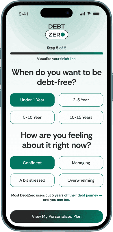
The core user journey was designed around one goal — get the user from zero context to a personalised repayment plan in the fewest possible steps.
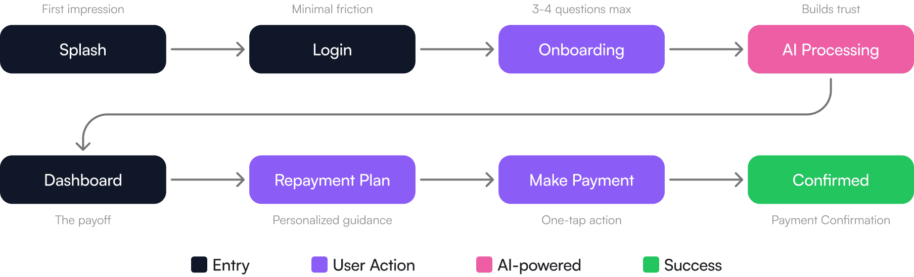
Why We Prioritized One Action
One of the biggest behavioral problems in debt management is action paralysis.
Users often face:
• Multiple debts
• Different interest rates
• Different due dates
• Conflicting repayment advice
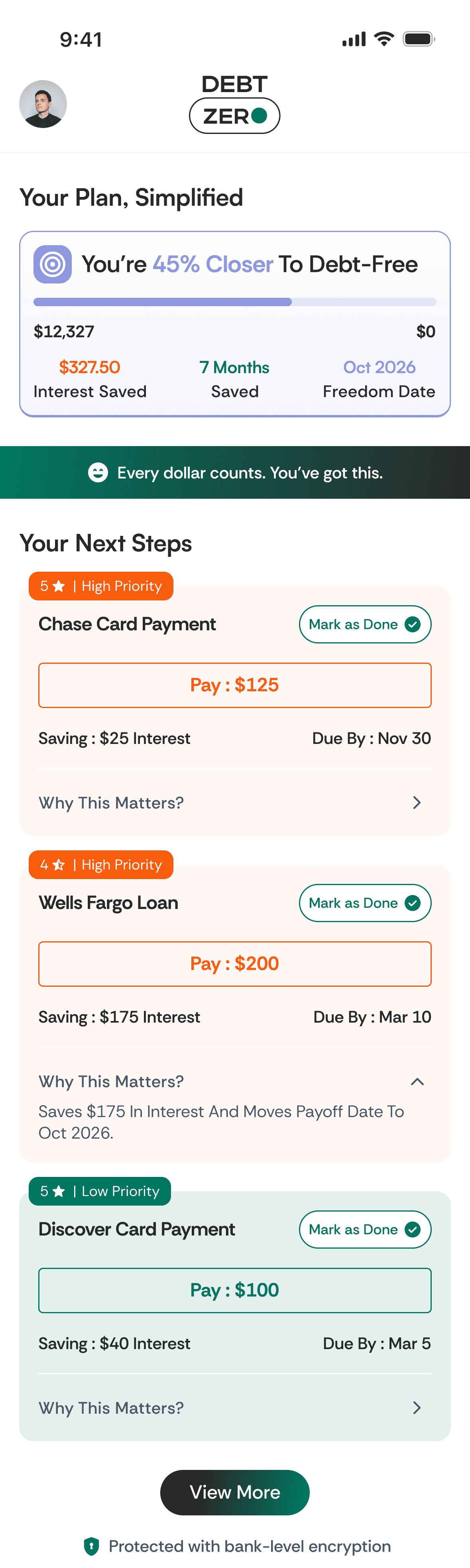
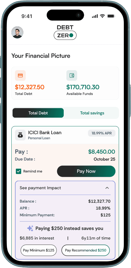
Instead of presenting multiple competing actions, the dashboard was intentionally designed around a single recommended next step.
The goal was to reduce cognitive overload and help users feel immediate clarity after opening the app.
Wireframes were kept intentionally rough to keep founder feedback focused on flow, not aesthetics. Key decision at this stage: moved the recommended payment action above the fold on the dashboard after the first round showed users scrolling past it. Three layout directions were explored for the debt overview a card stack, a list view, and a chart-first approach. The chart-first was dropped because it led with data anxiety rather than action clarity
Key Design Decisions
01
Decision
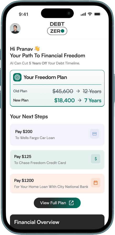
Repayment Insights
The Problem:
Generic dashboards don't motivate action. Users don't know what to do next.
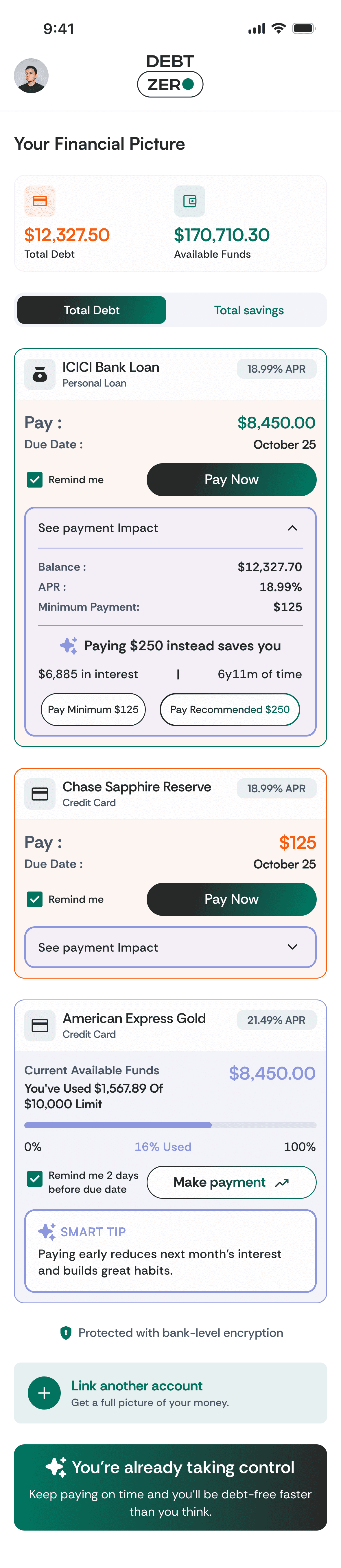
The Solution:
Designed a dynamic AI insight card on the dashboard that analyzes the user's debt portfolio and surfaces a personalized recommendation.
Why:
Debt repayment is a behavioral problem, not just a math problem. People need to feel like there's a plan built for them.
02
Decision
The Trust Redesign
The Problem:
The first version of the product felt technically correct but emotionally distant. The founder flagged it — users might not trust it with sensitive financial data.
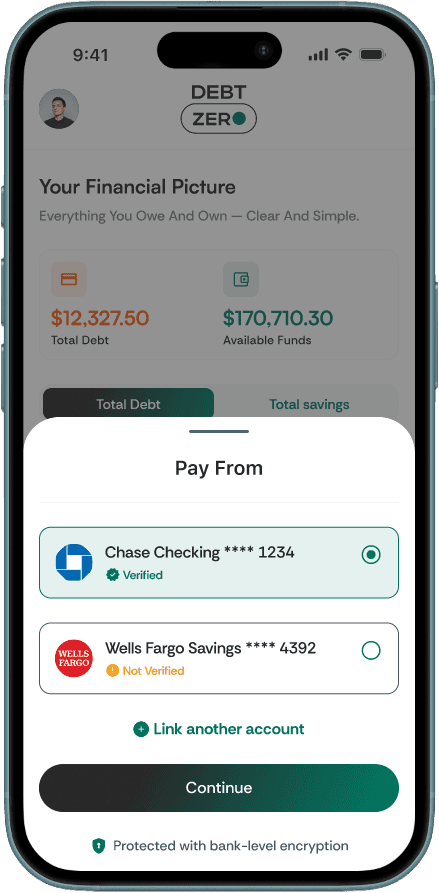
The Solution:
Studied Paytm, Google Pay, and PhonePe to understand how high-trust financial products build confidence. Then redesigned key screens with familiar UI patterns, visual reassurance, cleaner layouts, and simpler language.
Why:
Trust is not a feature it's a feeling. In fintech, if users don't trust you in the first 30 seconds, they leave.
Trust Design Principles
Familiar financial patterns
Inspired by products users already trusted like Google Pay and Paytm
Reduced visual anxiety
Aggressive warning colors and dense tables were minimized
Clear next-step communication
Users should always understand what action is recommended & why
03
Decision
Emotional Tone, Not Just Data
The Problem:
Most finance apps make users feel worse about their situation.
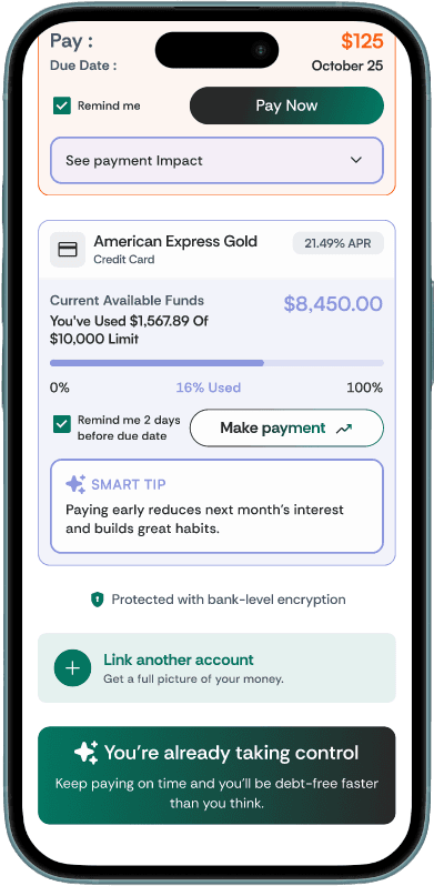
The Solution:
Designed motivational progress indicators, milestone celebrations, and copy that focuses on progress rather than debt amount.
Why:
Behavioral economics shows that visible progress increases follow-through. If users feel they're winning, they keep using the product.
04
Decision
Mobile-First, Calm Visual Language
The Problem:
Competitors' apps used aggressive reds, warning icons, and dense tables — all stress-inducing.
The Solution:
Built a calming visual system soft backgrounds, clean type hierarchy, generous whitespace, and a color language that separates "alert" from "insight."
Tradeoffs & Prioritization
To keep the MVP focused and reduce onboarding complexity, several features were intentionally deprioritized:
• Credit score tracking
• Financial education modules
• Debt settlement marketplace
• Advanced budgeting tools
• Gamified reward systems
The product focused first on helping users answer one core question clearly:
“What should I pay next?”
How I Tested It
Without a live user base, I ran an informal prototype walkthrough with 3 people one carrying credit card debt, one with a personal loan, one with both.
Goal: could they reach a recommended payment in under 2 minutes without guidance?
All 3 completed onboarding. The debt snapshot screen ("here's what we see so far") was flagged as reassuring by 2 of 3 they said it felt like the app was working for them, not judging them. One user skipped the repayment strategy and went straight to "Pay Now" which confirmed the one-action-first philosophy was right
Outcome & Reflection
My first instinct was to show users their full debt picture upfront total owed, all accounts, every number.
The founder flagged it: it felt overwhelming, not empowering. So I flipped the philosophy lead with the next action, not the full problem. That one change restructured the entire dashboard hierarchy and became the product's core UX principle."
BEFORE
Iteration 1 : Led with the full problem
AFTER
Iteration 3 : Final, Led with the next action
The Final Experience
"The product was designed and delivered for a US-based fintech founder. Post-design, the product was rebranded and repositioned by the client. This case study documents the design process and decisions made during the engagement."