B2B SaaS
Solo Designer
0→1 Product
Design tools
Platform
Web (Desktop First)
Status
MVP · Internal Testing

The 77 million Trap
The workflow holding every design agency back existed right inside the agency.
Trippy Ants like most design agencies had a client feedback problem that wasn't caused by bad clients. It was caused by the absence of any structured system for giving, receiving, tracking, and approving design work. The breakdowns were consistent and repeated across every project.
"How might we give design agencies and their clients a shared, structured platform to review design work where feedback is contextual, versions are trackable, approvals are documented, and internal quality is protected before anything reaches the client?"
My Approach
Research, then system, then screens.
Revue was a 0→1 product with no existing benchmark no direct benchmark existed for our specific agency context. The starting point was understanding the actual agency structure and the roles inside it before touching Figma.
The co-founder's framing was direct: agencies were losing time and client trust due to fragmented communication. The product needed to be structured enough to bring order, and simple enough that a non-designer client could use it without training.
What we found in research:
We spoke with 3 people per role type Account Managers, Client Servicing, Designers, and Clients across different industries.
We assumed clients were the main problem. Research showed the real bottleneck was internal Client Servicing had no structured tool to manage the designer ↔ client handoff. They were manually bridging two broken communication systems simultaneously.
One insight that directly shaped the product: clients didn't struggle to give feedback they struggled to know if their feedback had been acted on. That single finding led to the checklist-based version upload system.
01
Map the agency structure and observe the broken workflow
Worked with the co-founder (who had domain relationships across industries) to study how design feedback and approval actually worked across 3 people per role type Account Managers, Client Servicing, Designers, and Clients. Mapped all 4 user flows before drawing a single screen.
02
Built the component library after wireframes were validated
Wireframes helped validate the core flows first. Once the structure was confirmed, I built the full component library in Figma color tokens, typography, cards, tabs, modals, status badges, form inputs. Every screen then drew from the same foundation. This was the only way to achieve consistency across 4 distinct user roles solo.
03
Design role by role, flow by flow
Designed starting from Account Manager (the first role in every project flow) downward. Each role's screens were completed before moving to the next, so the handoff points between roles were always grounded in what the previous screen actually produced.
04
Two-mode system discovered through brainstorming
The Productive vs Creative mode distinction emerged mid-process during team brainstorming not from the original brief. It solved a real tension: the same platform needed to support focused, fast delivery work AND open creative exploration. One mode couldn't serve both without compromising both.
05
Prototype for alignment
Delivered a fully linked Figma prototype across all 4 user flows. Used as the functional spec for the developer replacing verbal descriptions and avoiding build ambiguity across the MVP.
Users & Roles
Four roles. One platform. Tailored access at every level.
Revue isn't a single-user tool. It maps a full design agency structure each role sees a version of the product calibrated to exactly what they need to do, and nothing they don't.
The USP
Two modes. One product. Because not all work is the same.
The biggest insight from research: different project types need entirely different collaboration structures. A fast, repeatable banner delivery doesn't need open brainstorming. A new brand identity exploration shouldn't be bottlenecked by a 1-to-1
channel. One unified mode would have compromised both. So we built two set at the brief level, before a project begins.
For example a monthly social media banner delivery for a repeat client needs speed and minimal noise. Productive Mode handles this in 1-to-1 communication between Client Servicing and the designer. But a brand identity project for a new client needs the CEO, marketing head, and creative team all exploring ideas together. Creative Mode opens that channel without restructuring the entire product.
Key design decision
The mode is set when the brief is created not changed mid-project. This means the entire workflow runs under one consistent structure from day one, and all team members know exactly what level of communication to expect before work begins.

End-to-End Flow
From first brief to final approval.
Six stages. Four roles. One loop repeating until the client formally approves and the project closes.

View Flows in Figma
1
Account Manager
Client Setup & Brief Creation
Creates new client profile, uploads brand assets (logo, design system, branding guidelines). Creates a project brief and sets the collaboration mode. Everything downstream runs on this foundation.
2
Client Servicing
Brief Clarification & Task Assignment
Picks up the brief, takes clarity from the client on scope and expectations, assigns tasks to the designer with timeline and deliverable details.
3
Designer
Design & Upload Iteration
Receives brief, creates the design, uploads to the UCC Page. In Creative Mode, may also collaborate directly with client-side members during ideation.
4
Client Servicing / Design Head
Internal Quality Check
Before any design reaches the client, it passes through an internal QC gate. Approved or returned to designer. Nothing goes to the client without internal sign-off protecting the agency's quality standard.
5
Client
Review, Annotate & Feedback
Client views design on UCC Page. Pins annotations directly on screen (PDF-style), leaves comments, compares with previous versions via the Compare Module. Approves or requests changes.
6
Designer → Client Loop
Revision Until Final Approval
Designer uploads new iteration. A checklist appears every piece of previous feedback must be explicitly marked resolved. Client verifies via Compare Module. Loop repeats until formal approval is logged with timestamp and user identity.
Key Design Decisions
The three problems that required the most thought.
Revue isn't a single-user tool. It maps a full design agency structure each role sees a version of the product calibrated to exactly what they need to do, and nothing they don't.
01
Decision
Building a version history that non-designer clients actually understand
The problem:
Clients had no way to see what changed between iterations. "Did they fix the thing I mentioned?" required a call. Old feedback kept resurfacing. The version history had to work for someone who opens design tools once a month not a designer.
Options:
Side-by-side diff view with automated change highlighting; version notes written by designer only; a full compare module with visual side-by-side plus a checklist-based resolution system on upload.
The Solution:
Three-part system:
(1) All versions accessible to everyone clients, designers, managers. Nothing hidden.
(2) When a designer uploads a new version, a checklist appears every piece of previous feedback must be explicitly marked resolved before submission.
(3) A Compare Module old design left, new design right, side-by-side. No diffing required from the client.
Why:
Automated diff highlighting is technically complex and visually noisy for non-designers. The checklist creates accountability without cognitive load the designer is doing the work of showing "I addressed this," not the client doing the work of verifying it. The Compare Module is visual confirmation, not a task.

02
Decision
Making two modes feel visually distinct within one design system
The problem:
Productive Mode restricts communication to 1-to-1. Creative Mode opens it to the full team. Both modes use the same components, the same layout, the same design system. The UI needed to clearly signal which mode was active so users always knew what level of access they had without building two separate products.
Options:
Separate colour themes per mode; a permanent mode banner at the top of every screen; visual lock states on restricted communication areas in Productive Mode; a combination of visual treatment + contextual messaging.
The Solution:
In Productive Mode, non-participating team members see the communication panel in a locked/greyed state with a label: 'This project is running in Productive Mode only Client Servicing and Design Head can communicate here.' They can read the thread but cannot type. In Creative Mode, the same panel opens fully with an active input for all members. Same component, two states no separate screen needed.
Why:
Users shouldn't have to remember which mode they're in the UI should tell them. But a full colour theme switch per mode would feel like two separate products. The solution had to feel like one product with a clear state, not two products sharing a codebase.

03
Decision
Designing the UCC Page for non-designers without dumbing it down
The problem:
The UCC Page Upload, Checklist, Communication is the core screen of the entire product. It had to serve both sides: designers uploading and resolving feedback, and clients viewing and annotating designs. These two users have entirely different mental models. One screen had to work for both without requiring training.
Options:
Separate screens per role action; a tabbed interface splitting upload, checklist, and communication into three views; a single unified page with contextual panels surfaced based on role and action state.
The Solution:
Tabs Upload, Checklist, Communication keep the three actions separated without hiding them. Role-based view logic shows the designer's upload and checklist panel; shows the client's annotation and approval panel. The design viewer is always present. The communication thread is always visible on the side. No navigation away from the design to take any action.
Why:
Context preservation. Every action annotating, checking off feedback, approving happens in direct relation to the design on screen. The moment you navigate away to take an action, the design becomes abstract. Keeping everything on one surface is what makes the feedback loop fast.
Core Screen
The UCC Page Upload, Checklist & Communication.
Every project in Revue lives on one screen. Where designers upload, clients review, feedback resolves, and approvals happen all in context, all in one place. This screen went through the most iterations of anything in the product.
Design Viewer
Full-screen design display, always visible. All actions happen relative to what's on screen context never breaks.
Annotation Layer
PDF-style pinned comments directly on the design.Feedback is always contextual not floating in a chat thread.
Version Timeline
All iterations accessible and navigable. Full history visible to all roles. Nothing is hidden or overwritten.
Checklist Panel
Designer-facing. Every piece of previous feedback must be resolved on upload. Accountability built into the action, not added after.
Communication Thread
Mode-dependent. 1-to-1 in Productive, open team access in Creative. Always visible in context with the active design.
Approval CTA
Formal approval logged with user identity and timestamp. The end of the revision loop documented and undisputed.

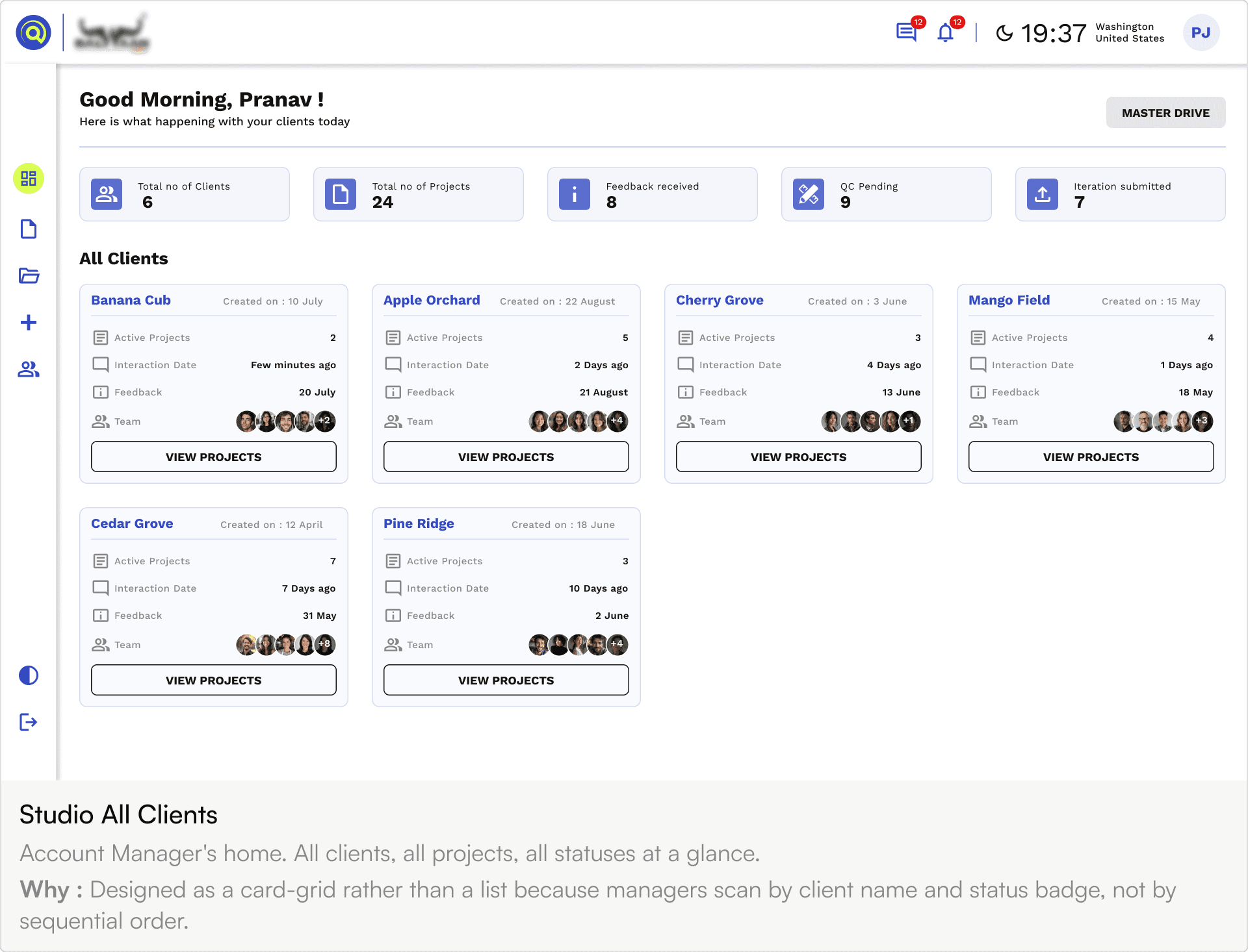
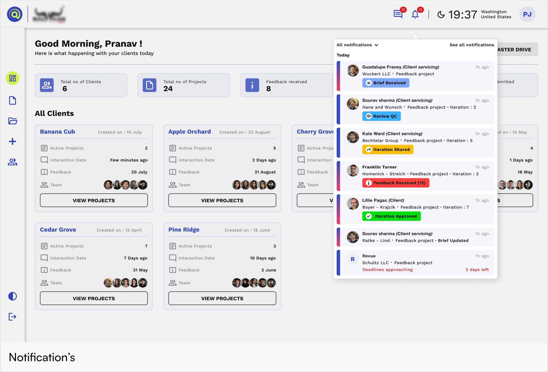
Module Overview
Every major surface in the product.
Replace each placeholder with your Figma exports. The challenge wasn't designing each screen in isolation it was maintaining consistency across four different user roles with completely different data structures and intents.


Design System
Built from scratch. Every component has a reason.
Built after wireframes were validated so every component was grounded in an actual use case, not a theoretical pattern. The only way to design 4 user roles with full consistency solo.
01 Color System
Primary Blue
#1A3DF5
Neon Green
#B8FF36
Black
#0D0D0D
Surface
#F7F7F5
Border
#E0E0E0
Muted Text
#888888
Blue = trust, structure, and B2B professionalism. Neon green = creative agency energy and distinctiveness. Together they separate Revue from generic enterprise SaaS without feeling consumer-toy.
02 Typography
Work Sans
Clean, geometric, legible at small sizes. Neutral enough to never conflict with client-uploaded brand assets.
700 Headings
600 Subheads
03 Core Components
Tags / Status Pills
Brief Received
QC Pending
Review QC
Iteration Shared
Feedback Received
Iteration Approved
Cards
Wintheiser and Sons
Created on : 10 July
Deadline
20 July (10 Days Left)
Status
Iteration Approved
Project mode
Creative Mode
Team


+2
Approved
Emard, Cormier and Koelpin
Created on : 10 July
Deadline
20 July (10 Days Left)
Status
Feedback Received
Project mode
Productive Mode
Team
+2
Brief
Feedback (3)
Herman - Muller
Created on : 10 July
Deadline
20 July (10 Days Left)
Status
Iteration Shared
Project mode
Productive Mode
Team
+2
View Iteration
Metz and Sons
Created on : 10 July
Deadline
20 July (10 Days Left)
Status
Review QC
Project mode
Creative Mode
Team
+2
Brief
Review (3)
Marvin, Monahan and Bechtelar
Created on : 10 July
Deadline
20 July (10 Days Left)
Status
QC Pending
Project mode
Creative Mode
Team
+2
Brief
QC
Cronin Inc
Created on : 10 July
Deadline
20 July (10 Days Left)
Status
Brief Received
Project mode
Productive Mode
Team
+2
View Brief
Outcome & Impact
The product is built and currently in internal MVP testing at Trippy Ants.
Quantitative usage metrics aren't yet available Revue is in MVP testing at Trippy Ants. But the qualitative signals from the build and internal feedback are clear.
01
Every revision is documented nothing disputed
All feedback, all iterations, all approvals logged with user identity and timestamp. "I never approved this" is no longer a conversation that can happen.
02
Designers focus on design not feedback logistics
Zero time chasing feedback across channels. It's all in one place. The checklist system means designers know exactly what needs to be addressed before uploading.
03
Clients see project progress without asking
Project timelines, design status, and version history are visible to clients at any time. "What's the status?" becomes unnecessary.
04
Two-mode system serves two previously incompatible needs
Productive and Creative modes coexist in one product fast delivery work and open exploratory work each get the collaboration structure they actually need.
What was delivered
✓
End-to-end product design across 4 distinct user roles with tailored flows
✓
Two-mode collaboration system Productive and Creative first-of-its-kind for agency workflow tools
✓
Version history with designer-side feedback resolution checklist on every upload
✓
Side-by-side version compare module for client-side verification
✓
Full design system built from scratch Work Sans · Blue + Neon Green
✓
Fully linked Figma prototype across all user flows used as functional spec for development
✓
MVP in active internal testing at Trippy Ants
Reflection
What this project permanently changed about how I design.
What I'd do differently
The project flow is slightly longer than needed. Some steps between Client Servicing and Designer could be compressed without losing the accountability layer. I'd run that specific flow through usability testing earlier and trim steps before building them in full fidelity.
What I'm most proud of
The two-mode system. It wasn't in the original brief it emerged from honest problem analysis during brainstorming. Recognising that one mode couldn't serve two fundamentally different working styles, then solving for both within one product, is the kind of product thinking I want to bring to every role.
What I'll carry forward
0→1 design without a PRD forces you to define scope, make real product decisions, and push back on feature creep independently. That's not a disadvantage it's a test of whether you can think like a product manager, not just execute like a designer. Revue is where that shift happened for me.